.png)
Chocolati
Website Redesign for Chocolate Cafe to Improve Online Sales, Brand Identity, and User Experience
Our Client
Project Overview
Project Overview
Roles & Responsibilities
As a UI/UX Researcher and Designer, I conducted the following:
-
Conducted (5) Contextual Inquiries on existing website
-
Developed (3) user personas
-
Conducted (5) card sorts
-
Built website Information Architecture
-
Developed Wireframes
-
Developed Low and Medium Fidelity Prototypes
-
Conducted (2) Usability Studies
-
Developed UI Style Guide
-
Collaborated on and Iterated prototype design
-
Prototyped all interactions seen in final High Fidelity prototype
Overview
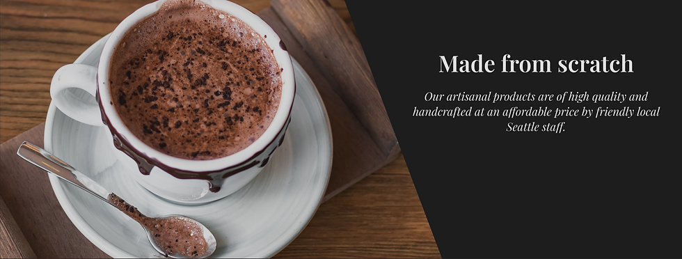
Chocolati is a well-known chocolate shop located in Seattle, Washington. Founded in 2003, the shop offers a wide variety of handmade chocolates, baked goods, and hot beverages, all crafted with the finest ingredients.
As the business has grown, the team at Chocolati has recognized the need to focus its market on hot chocolate and improve its web experience. They want to maintain their branding of offering handmade goods, incorporating an old-school Seattle aesthetic.
Team
Project completed in a team of 5 with the University of Washington department of Human Centered Design and Engineering
Duration
3 Months
Deliverables
-
Hi-Fi Prototype of a Redesigned Website
-
User Research & Personas
-
Information Architecture
Tools & Software
Figma, Google Docs, Optimal Sort, Zoom, Slack, Chocolati.com
By establishing a strong brand identity and emphasis on key products, the solution aims to improve online sales.
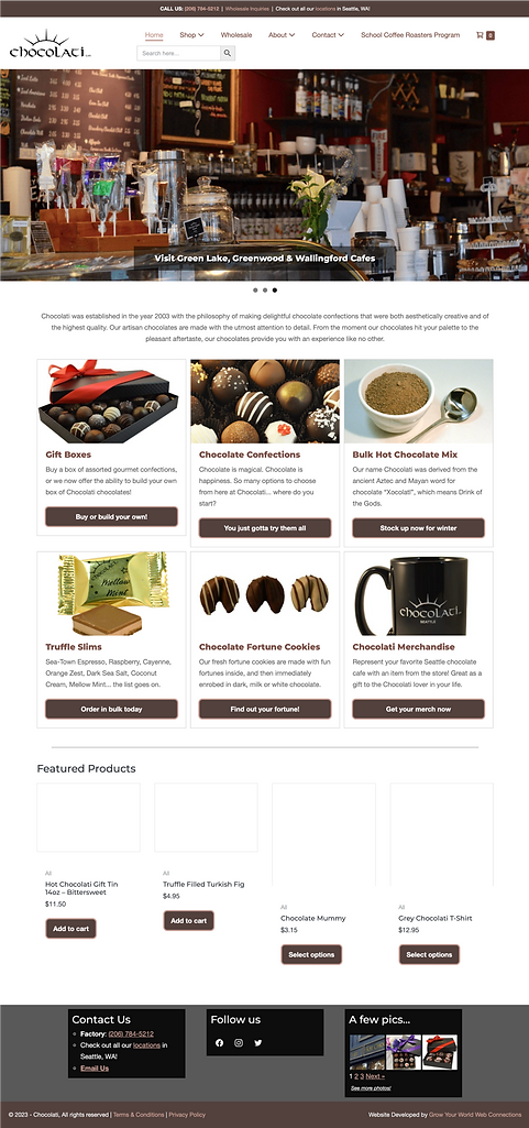
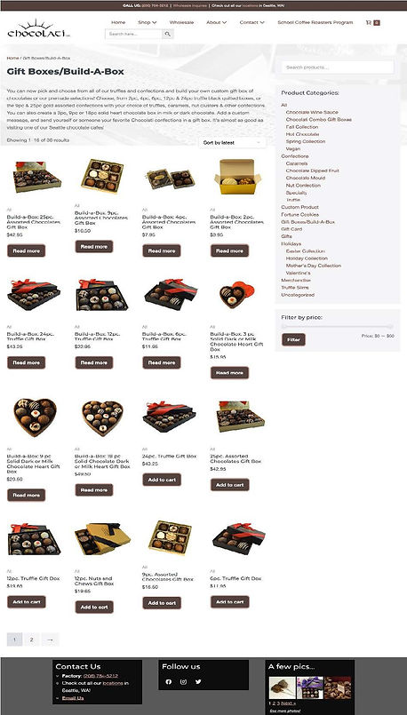
Before

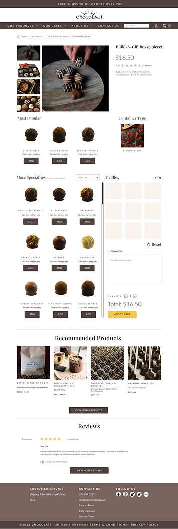
After

Design Process
Business Goals
User Research
Site Visit
Comparative Analysis
Usability Studies
Contextual Inquiries
Website Analytics
User Personas
How Might We Problem Statement
Target Goals
Card Sorting
Information Architecture
Lo-Fi Paper Prototypes
Wireframes
Usability Testing
Design System
Hi-Fi Prototype
The Problem
-
The client is seeking an increase in online sales but is unsure of where the usability issues lie.
-
The website does not reflect the company's vibe or that they strive to be a go-to gourmet hot chocolate purveyor.
The Goals
The main project goals for Chocolati are to shift the online focus to hot chocolate products and provide customers, specifically prospective customers, more information on their physical locations and a clearer brand identity of being an “Old Seattle” establishment.
Discover
Business goals
-
Increase the average number of items added to the cart
-
Increase clicks to the hot chocolate page
-
Increase clicks to physical cafe information pages
-
Increase the selection of local pick-ups
Branding goals
-
Create an online experience that aligns with the company’s brand values of being an “Old Seattle Vibe/neighborhood hangout”
-
Enhance product presentation
Usability goals
-
Increase discoverability of hot chocolate products
-
Increase discoverability of cafe information, including cafe menus/offerings
-
Decrease confusion of category types
Research
Site Visit
One of the first things we did was take a tour through Chocolati's factory and visit their cafe locations. In doing so, we identified things that we wanted to eventually highlight in our redesign. These were things like the history of the business, some of their core values, types of products they sell, and some of their branding.


Comparative Analysis
For competitive analysis, we researched Caffe Ladro, Theo Chocolate, Fran's Chocolate, See's Candy, and Dilattante Chocolates. We checked the ease of navigating through their websites, clarity in how products were displayed and described, and how other cafes and chocolate companies communicate their company brand. After analyzing, we noted takeaways and improvement areas for each website, and considered what features should be brought to Chocolati.com.
Caffe Ladro
Fran's Chocolate
See's Candy
Dilattante Chocolate


Hero Image
Strong Visually appealing products
Well organized top navigation and clear categories
Some buttons and text are difficult to read/ easy to miss
Imagery is low-resolution
4 Usability Studies of Existing Website
We conducted 4 usability studies to specifically understand the existing successes and pain points of the Chocolati website, and our target users’ experience and perspective about:
-
Searching for and purchasing a chocolate product online to give as a gift.
-
Ease of filtering and navigating through the different product options.
-
Discoverability of information about the company and their cafes.
Through some preliminary usability testing, it was discovered from the participants that there were struggles navigating between product categories and challenges in viewing the checkout for multiple gift boxes.
5 Contextual Inquiries of Existing Website
Since the Chocolati website is already existing, we conducted 5 contextual inquiries where we had participants think out loud while they were going through the current website. The website evaluation from several participants provided insight on some pain points on the current site such as lack of information regarding local pickup, wanting to have clearer cues on access product details, and visibility for hot chocolate products not being apparent until prompted
Website Analytics of Existing Website
Based on some insight from the client, it was discovered that product ratings had been disabled and from customer feedback, the order processing/confirmation was confusing for many users. Although hard data analytics were not readily available until later, we discovered that many of the pages that we included in our redesign lined up with the high traffic pages such as the home page,hot chocolate, gift boxes, cafe locations, shop category pages, and about.
User Survey
We conducted a survey to understand what factors, components, and options are most important to customers when purchasing chocolate products online. Through the survey, we came to find out that access to purchasing handmade chocolates in a store is important to many customers and that the majority of participants look on the company's website prior to visiting the store.

Theo Chocolate
Takeaways
-
Color palette/branding that is more aligned with their theme, goals, and ethos
-
Using similar search filtering functionality and categorization of products for Chocolati
-
Option to pause rotating banners.
Improvement Areas
-
Banners are very text heavy.
Define
Meet the Users
We created three personas, Greg, Sara, and Nancy, to determine each user's goals, tasks, and challenged when purchasing chocolate products online. Each persona includes basic demographic information, a personal story, individual goals, challenges, and their relationship to Chocolati.


How might we...
present a clear brand to new customers and entice users to navigate to the hot chocolate and gift box products?
Target Goals

Create an online experience that aligns with the company’s brand values of being an “Old Seattle Vibe/neighborhood hangout”.
Increase discoverability, clicks, and sales of gourmet hot chocolate products, as well as to better establish Chocolati's brand as the "go-to hot chocolate spot".
Increase overall online sales and average amount of items purchased during a typical transaction.
Ideate
Card Sorting
We had 17 individuals participate in a card sort to help us understand how customers group the various product types and features on the Chocolati website. Several patterns were identified, which assisted us in building a new Information Architecture for the website.
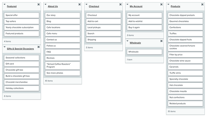
-
7 out of 17 participants grouped all chocolate items together to be under a "Products" tab, rather than the existing tab of "Shop".
-
8 out of 17 participants noted a separate grouping that was specific to seasonal collections and gifts. Many labeled this tab as Gifts & Special Occasions
-
8 out of 17 participants defined a separate cafes group from the About Us group for the cafe locations and menu
Information Architecture

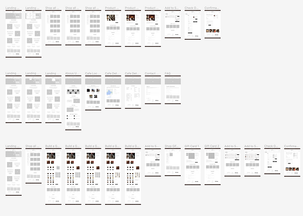
Low Fidelity Sketching and Paper Prototypes


Iterate
Wireframe Prototypes & Usability Tests
8 Usability Tests
After gathering, analyzing research and developing a new Information Architecture, we built wireframes and low-fidelity prototypes for the revamped Chocolati desktop website. The designs focus on increasing the discoverability and opportunity for image display of the hot chocolate products and physical locations, as well as opportunities to declutter the site's components. We then refined the design after conducting usability testing.
Our main goals and tasks that we set out to test included:
-
Discoverability and appeal of purchasing the Gourmet Hot Chocolate products
-
Ease of finding cafe locations and details
-
Process of putting together an order that is intended to be a gift

What went well:
-
5 out of 8 participants noted that they found the product categorization intuitive and they were able to locate the desired products through the categories and filters
-
8 out of 8 participants were able to complete all tasks successfully
Iteration
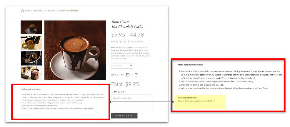
3 out of 8 participants wanted to see product ingredients on a product details page
Outcome: We added product ingredients below the product descriptions
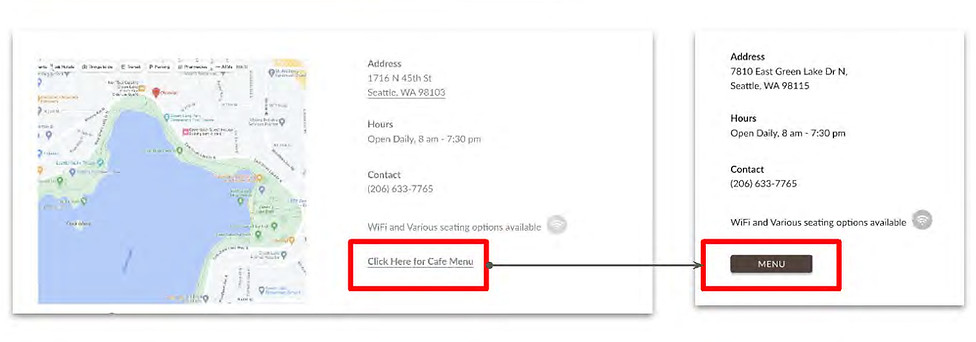
5 out of 8 participants were unsure if the cafe
menu was specific to thecafe location
Outcome: We revised the Menu link to be a universal button on the cafe page and noted on the cafe menu that items may vary by location

3 out of 8 participants noted that the truffle page was cumbersome with the container options and that they had to scroll a bit to get to the truffles
Outcome: We removed the container option and kept the chocolate heart box as a separate product, which is how the products are sold today
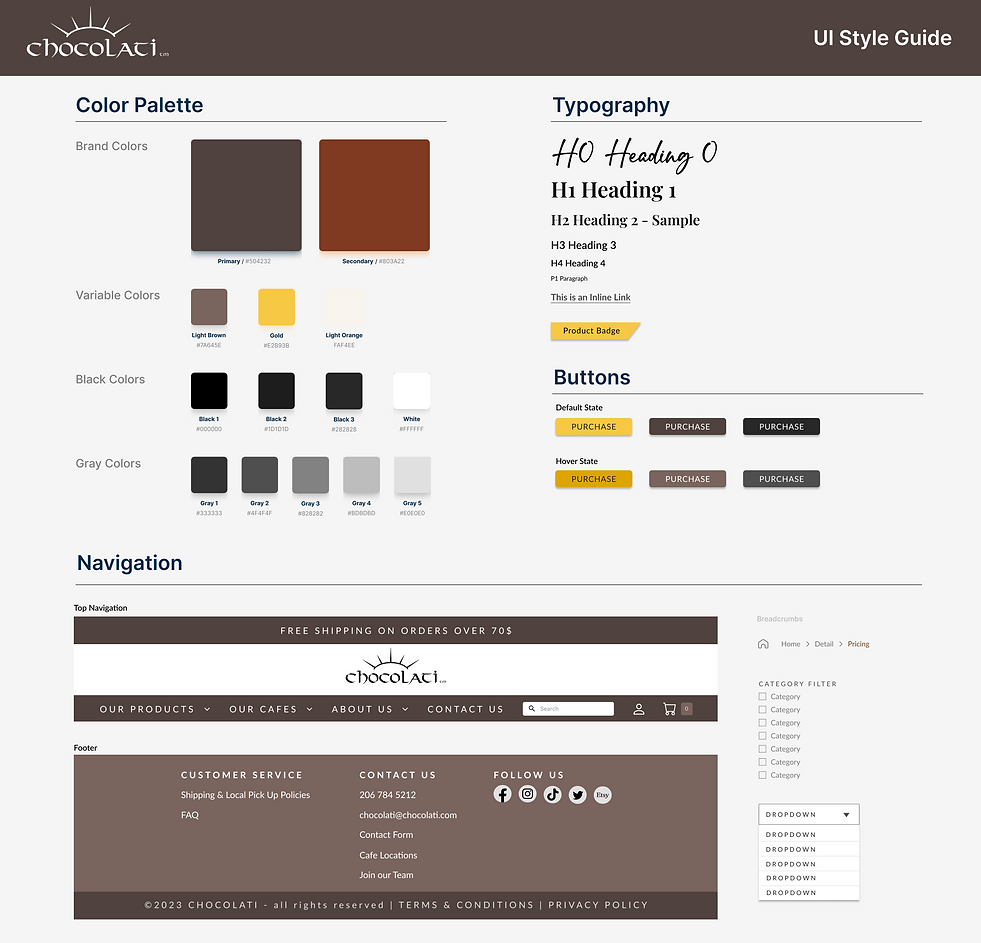
Design System
We developed a UI Style guide to assist us in capturing an "old Seattle vibe" while also aligning with Chocolati's current cafe color palette. Chocolati’s cafe colors are derived from the cocoa pod, which was our starting point with the color selections. Yellow was selected as an accent color, as it proved to be the most accessible with the typography.
Wireframe Prototype & Usability Tests
4 Usability Tests
We developed Medium fidelity prototypes for digital and physical artifacts. We conducted 4 Usability Tests with specific tasks and evaluated and applied the feedback.


Instacart Mobile App Feature Prototype
-
2 out of 4 participants found “Local” category title to be too vague -> Outcome: The category was renamed to “Farmer's Markets”
-
4 out of 4 participants attempted to use the back button to access the Farmer's Market homepage, instead of using the bottom navigation -> Outcome: Back button enabled


Signage Prototype
-
3 out of 4 Participants noted they would respond to the signage if the logo was bigger and if it was clear that it was a partnership with Instacart -> Outcome: Logo was made larger and “powered by” Instacart was added.
-
1 out of 4 participants was unsure of where the QR code leads -> Outcome: A URL was added below the QR code.
Newsletter Prototype
-
1 out of 4 participant noted that they may want to opt out of the newsletter weekly -> Outcome: Instructions of how to opt out was added.
-
2 out of 4 participants were unsure of where the QR code links to -> Outcome: A URL was added to the top of the newsletter.
Solution
High Fidelity Prototype
With a design system in place and directives from our usability sessions, a high fidelity prototype was developed. The design focused on:
-
Enhancing the customers' journey by better representing Chocolati’s branding, history, and values.
-
Helping users discover information about the company and store locations, in addition to making the products easier to find and understand.
-
A revamped checkout interface that is more informative, and ensures that the online experience is positive from start to finish.
Before
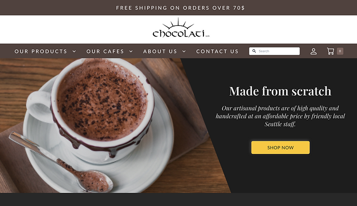
Homepage
After
Product Pages

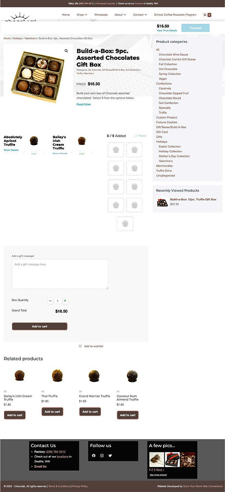
Product Details Pages
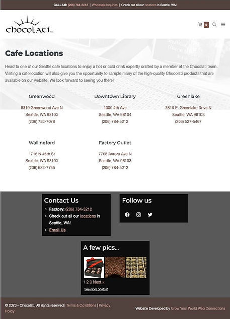
Cafe Pages
Potential Metrics
Appealing
Product
Display
Revenue
SUCCESS
Increase of
Online Sales
Experience
Community
Ties
Obstacles and Lessons Learned:
-
Limitation of time - If we had more time, we would have liked to:
-
Conduct more research, specifically with regards to the existing site’s analytics
-
Conduct A/B testing to get user impressions on various style options
-
Get more results on user’s perception of the style and branding of the new website design
-
-
Striking a brand balance and ensuring accessibility
-
Uncertainty regarding technical constraints behind the page building system and WooCommerce plugin.
Next Steps:
-
Implement the suggested design and allow for data to be collected on the specific goals and metrics defined at the start of the project process
-
Larger inclusion of accessibility


